Quinceañera Themes: Choosing Colors That Survive the Room
In a hall with no windows, half the color in your photographs was chosen by the DJ. What that means for the palette you pick nine months earlier.
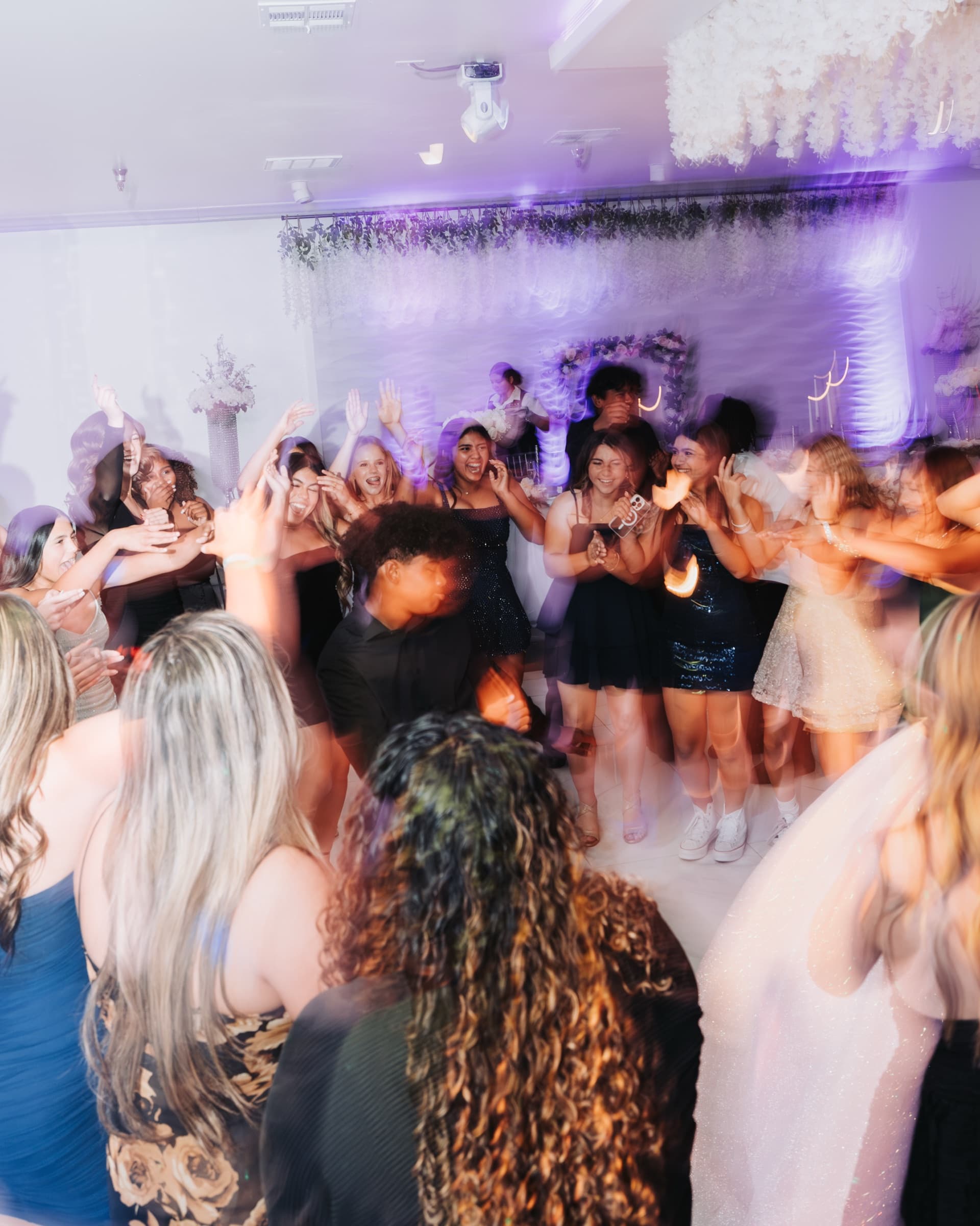
I have photographed quinceañeras in Fontana banquet halls with no windows at all. In a room like that there is no daylight to dilute anything, so the only color in the photographs is the color somebody brought: the dress, the linens, the flowers, and whatever the DJ is doing with the uplighting.
That last one is the problem. Families choose a theme nine months out, from photographs taken in daylight, and then spend the whole evening under lights nobody discussed. Half the palette in the pictures ends up being the DJ's decision, made at 4pm on the day, by someone who has never seen the invitation.
A theme is really three decisions
- Her dress — the one color that is in literally every frame of the night
- The court — the damas' dresses and the chambelanes' vests, ties or sashes, which appear in every group photo
- The room — linens, centerpieces, the entrance, and the uplighting
Families put most of the planning into the third one and most of the money into the first. But in photographs the second one is what usually goes wrong, and the uplighting is what nobody assigned to anyone.
What uplighting does to your palette
Uplighting is not decoration in a photograph — it is the light source. It lands on the dress, on the tablecloths and on people's faces, and it changes what color they are. This is not a thing a photographer can fully undo afterwards, because the room really was that color.
- Deep blue on a burgundy dress reads brown, sometimes almost black
- Magenta or hot pink on a blush or champagne dress reads orange, and puts the same orange on skin
- Green is the hardest of all on faces and the one I would think about twice
- Warm white and amber flatter nearly everything, and almost nobody asks for them
Two things to settle with the DJ, in advance, in writing. Pick the uplighting to agree with the dress rather than with the linens — the dress is in every photograph and the linens are in about a third of them. And ask for the house lights to come up for the vals specifically, then drop again, which is the single most useful sentence in this whole article and is also in the guide to the traditions.
Colors that hold up in a windowless hall
- Jewel tones — emerald, burgundy, royal blue, deep plum. They keep their identity in a dark room, as long as the uplighting is not fighting them
- Blush, champagne, ivory — beautiful in the daylight portraits, and the first to go muddy under colored uplighting. If this is the palette, ask for warm white only
- White and silver — clean and formal, but they blow out fastest near the dance floor lights, and the detail in the beading is the first thing lost
- Black accents — better than families fear. Black against a bright dress reads as contrast, not as gloom, and it keeps the court from competing with her
- Neon and electric brights — strong on the cake, the sign and the invitation; hard on skin, because that color bounces up onto every face near it
Outdoors is a different question
I once lined up sixty chambelanes and damas for group photos in an open-air hall in Perris, in 100-degree heat. Outdoors, the light is neutral, so the palette you chose is genuinely the palette you get — which is an argument for making the outdoor portraits the ones that carry the theme, and treating the indoor coverage as the party.
The trade is the sun and the heat. Dark suits in August in the Inland Empire are punishing, pale dresses blow out under direct midday sun, and a court of teenagers standing in it for twenty minutes will look exactly like a court of teenagers who have been standing in it for twenty minutes. Put the group photos in the last hour of light, not at two in the afternoon, and tell the court to arrive in the clothes rather than change on site.
Most themes are one color and a motif
Mariposas, Paris, charro, celestial, Bridgerton, Selena — the popular themes almost all resolve into one dominant color plus a motif that lives on the invitation, the cake, the centerpieces and the entrance sign. That is worth knowing, because the motif barely appears in the photographs and the color appears in every single one of them.
So spend the decision on the color and let the motif be light. A theme that only exists on four objects still reads perfectly in an album; a color that fights the room is in four hundred frames.
Four things that photograph better than a theme
- A dress that fits her, chosen for her, rather than one chosen to match the linens
- A court in one shade rather than five near-misses of the same shade — five burgundies from five different stores read as a mistake in a group photo, and this happens constantly
- Centerpieces low enough to see across. Tall arrangements hide half the table in every wide frame of the room
- One designed place: an arch, a sign, a doorway. You want a single spot in the venue that was built to be photographed in front of, because everyone will
The rest of the cluster: how the night is ordered in the guide to the traditions, dressing and rehearsing the court in the chambelanes and damas guide, getting the card out on time in the invitations guide, choosing the room in the Inland Empire venue guide, and what it all costs in quinceañera photography pricing. This guide is also en español.
I photograph quinceañeras across Riverside, Moreno Valley, Corona and the Inland Empire, bilingual, from $1,800 — see the packages.
Continue reading.
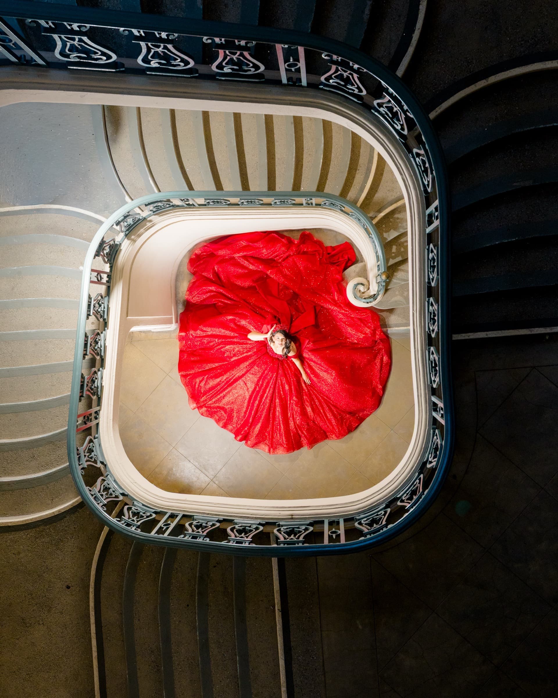
Chambelanes: What They Are and How the Court Actually Works
How many chambelanes, who they should be, and what they actually do on the day — including the part of the court that nobody explains until the week of the waltz.
Read article →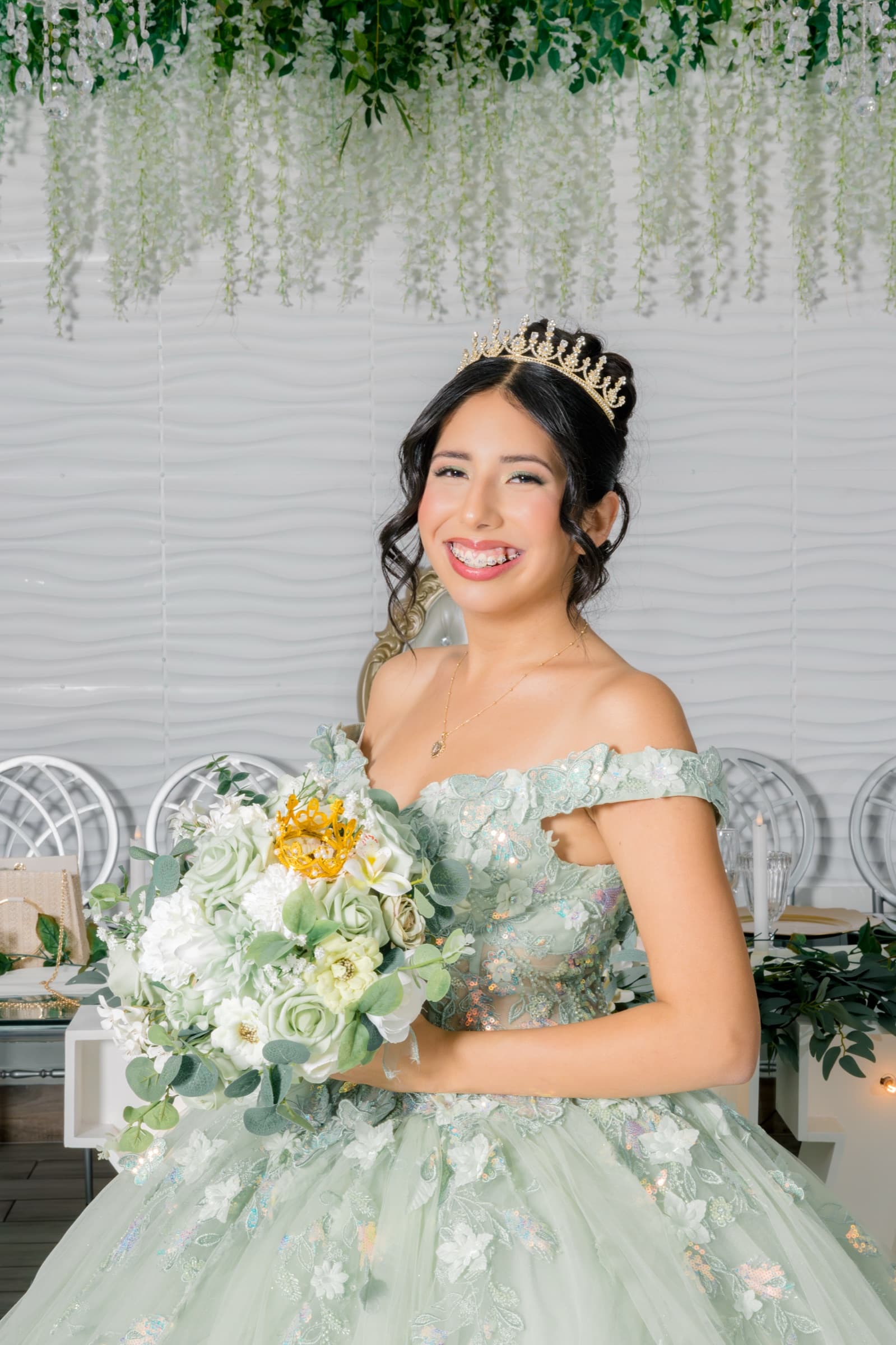
Quinceañera Traditions, Explained One by One
Each tradition has a moment, an order, and a reason. What they mean, when they happen in the night, and how to keep them from being lost in a dark room.
Read article →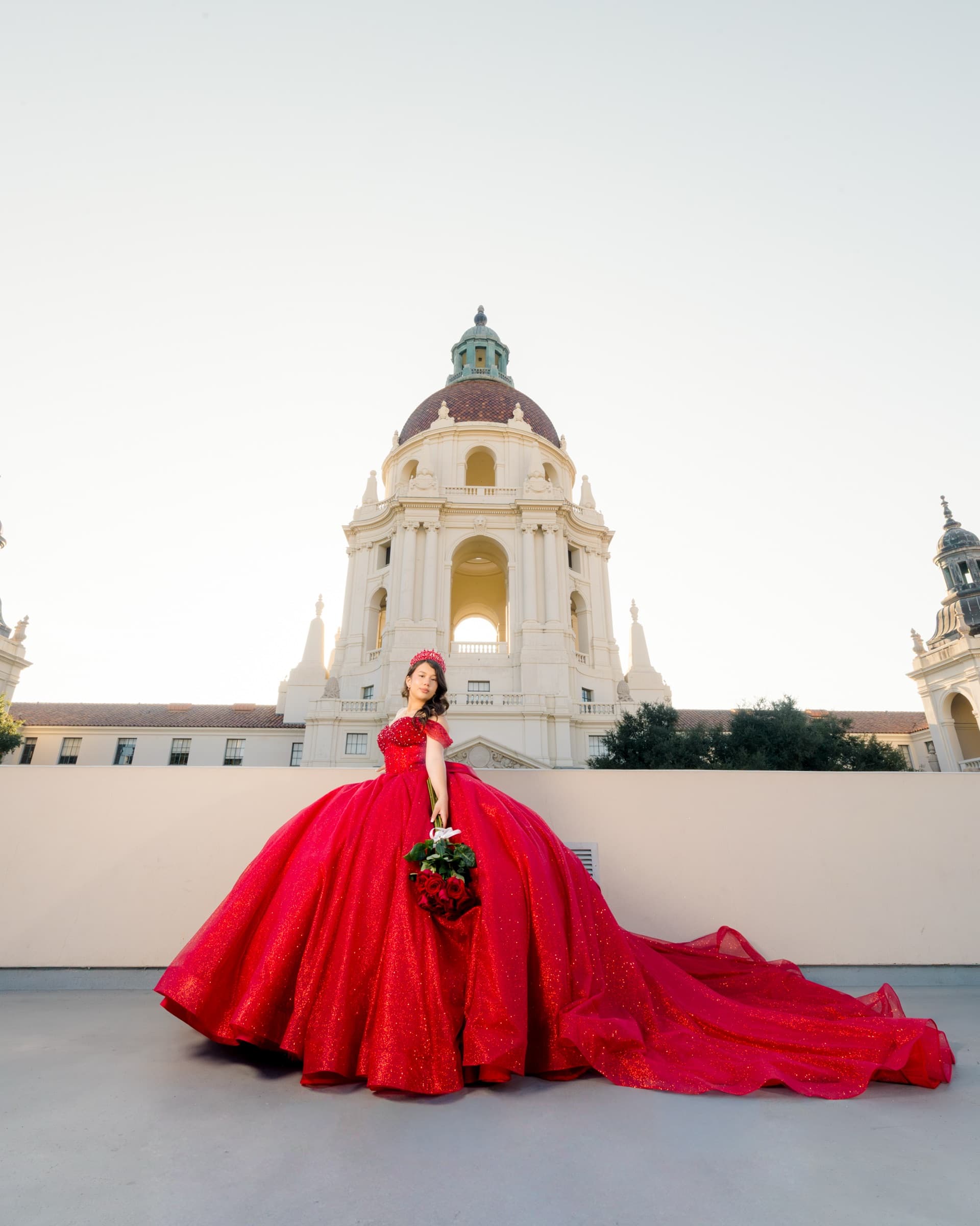
Quinceañera Invitations: Wording, Timing, and the Photo on the Front
Invitations go out six to eight weeks before the party, which means the portrait on the front has to exist months before that. Almost nobody puts that date on the planning list.
Read article →Tell us about
your day.
Dates fill quickly. Send a short note about your wedding — date, venue if you have one, and what you're hoping for. We reply within 24 hours.
Riverside, California · Inland Empire · Southern California